|
|

Element Type Window |

|

|

|
||
Element Type Window |
|
|
|

|
|
|
Element Type Window |
|
|
|
||
Element Type Window |
|
|
|
|
|
|
||
In the Element Type window you can define settings for an element type. You can access the Element Type window from the Modeling Options window.
General Tab
In the General tab you can define the general settings of an element type.
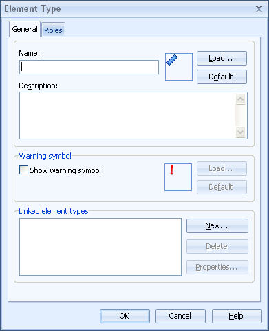
Define the name of the element type into the Name field and provide also an optional description into the Description field if you want to. Next to the Name field you can see the icon of the element type. Click the Load button to open a dialog in which you can select a new icon for the element type. Click the Default button to restore the icon to the default icon.
In the Warning symbol group you can define the warning symbol, which is displayed in the case some sub-element below an element in the hierarchy has its value in a range for which warning symbols have been toggled. Click the Load button to open a dialog in which you can select a new warning icon. Click the Default button to restore the warning icon to the default icon.
In the Linked element types group you can attach linked element types to your element type. To add a new linked element type, click the New... button. To delete an existing element type, select the type from the list and click the Delete button. To edit a linked element type, select an element from the list and click Properties... button. For more information on creating, deleting and editing linked element types, see Linked element types tab of the Modeling options window.
Supported image formats for the element type icon and the warning icon are BMP, PNG, GIF, and JPG. For transparent images you need to use either PNG or GIF. In addition, BMP images with the size of 16x16 pixels or smaller use the color in the bottom left corner of the image as the transparent color. In the QPR Metrics client the transparent color is displayed as transparent, but in QPR Portal it is displayed as white.
In the Roles tab you can define roles available for the element type. In QPR ScoreCard versions up to 7.4 there has been only one pre-defined role for all elements; In Charge. In the Roles tab you can now expand the selection of roles and define roles such as "In charge", "Updates values", and "Approves values". A different user can be assigned to each role, which allows you to define responsibilities in more detail.
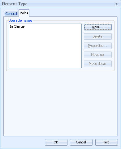
Click New to open the Role dialog for adding a new role. With the Delete button you can delete the role that's currently selected. Clicking the Properties button opens the currently selected role into the Role dialog for viewing or modifying the settings of the role.
You can modify the order of the roles with the Move up and Move down buttons. The order of the roles is important in the respect that the first role in the list corresponds to the "In Charge" role in the previous versions, meaning that the user in the first role is the recipient of for instance e-mail notifications related to the element in question. In addition, only the first role can be added to the basket in QPR Portal.