|
|

Organization Item Graphical Properties Dialog |

|

|

|
||
Organization Item Graphical Properties Dialog |
|
|
|

|
|
|
Organization Item Graphical Properties Dialog |
|
|
|
||
Organization Item Graphical Properties Dialog |
|
|
|
|
|
|
||
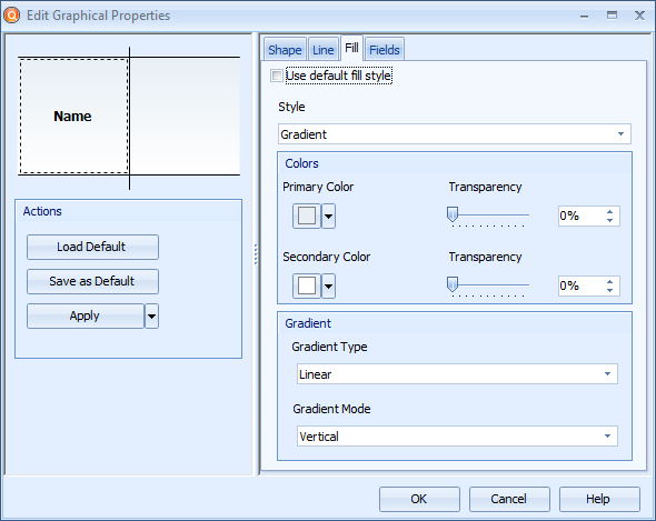
This dialog is used to edit the graphical properties of organization items. The dialog can be opened by right-clicking an organization item on the diagram and selecting Graphical Properties... from the pop-up menu.
Organization Item Graphical Properties dialog
Click the Load Default button to apply the default graphical properties to the selected Organization Item(s)
Click the Save as Default button to save the current properties as the default graphical properties for an Organization Item.
Click the Apply button to apply the graphical properties. To apply all graphical properties except size to all instances or all organization items of the current type, click the  button and select Apply to All Instances or Apply to All Elements of This Type from the menu.
Shape
The setting on the shape tab define the height of the organization item. To change the height of the organization item, type in the desired height to the Size field.
Line
The settings on the Line tab define the additional graphical properties for the lines used in the organization item. To use a custom line, remove the selection from the Use default line style and define the line properties with the following selections:
•The Width of the line in pixels can be defined either by entering a value between 1 and 100 to the value field or by using the arrows on the right side of the field.
•The Color of the line can be chosen from the drop-down list.
•The Transparency of the line can be defined by using the transparency slider, by entering a value to the field, or by using the arrows next to the field.
•The Dash style of the line can be chosen from the drop-down list. To define a custom dash style, select Custom Line from the drop-down list, and define the pattern in the Custom Dash Pattern field by entering a string that defines the pattern. A valid pattern definition contains an even amount of space-separated values ranging from 0 to 99. The first value in a value pair defines the amount of pixels that are drawn and the second one the amount of pixels that are left empty in the line. So for example a pattern "10 20 15 25" (without the double quotes) draws 10 pixels, leaves a 20-pixel gap, then draws 15 pixels and leaves a 25-pixel gap before starting over from drawing 10 pixels.
Fill
The settings on the Fill tab define the additional graphical properties for the background of the element. To use a custom fill style, remove the selection from the Use default fill style check box and define the fill properties with the controls provided:
Style
You can choose the style used in the background of the element from the drop-down list:
•The Solid style fills the background of the element with the chosen color.
•The Transparent style makes the element transparent, so that other elements that are behind it on the diagram can be seen through it.
•The Gradient style colors the background with a gradual blend of the primary color and the secondary color. From the Gradient Type drop-down list, you can select whether to use a rectangle or a linear gradient type. The settings of the rectangle gradient type are fixed. For the linear gradient type, you can select the direction of the gradient from the Gradient Mode drop-down list.
•The Texture style uses an image as the background of the element. You can select the image by clicking the Browse button. In addition, you can select how the texture is used on the element from the Wrap Mode drop-down menu.
•The Hatch style applies a hatch pattern to the background of the element using the primary and secondary colors. You can select the pattern from the Hatch Style drop-down list.
Colors
You can define the colors used in the chosen style from the Primary Color and Secondary Color drop-down lists. The levels of transparency for both colors can be defined by using the Transparency sliders, by entering a value to the fields next to the sliders, or by using the arrows next to the fields. Adding transparency will make the other elements behind the selected element visible through the selected element.
Fields
On the Fields tab, you can choose to show or hide the Name, Description, or any custom attribute types that have been defined for the organization item. To use a custom set of fields, remove the selection from the Use default fields check box and use the selection list to define which fields are shown or hidden. New fields can be added by clicking the Add... button. Click Properties... to define the properties for the selected field. Clicking the Delete button deletes the selected field.