|
|

|
Axes Tab of the Chart Properties |

|

|

|
||
|
Axes Tab of the Chart Properties |
|
|
|

|
Axes Tab of the Chart Properties
|
|
|
Axes Tab of the Chart Properties |
|
|
|
||
|
Axes Tab of the Chart Properties |
|
|
|
|
|
|
||

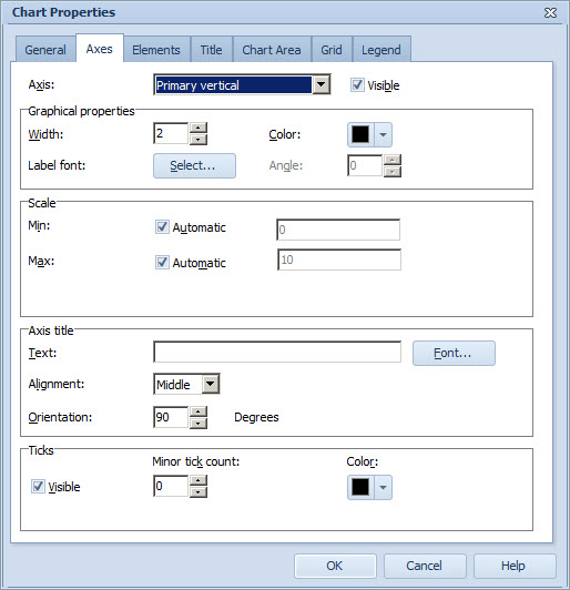
To define the settings of the axes in your chart:
| 1. | You can define settings for primary vertical, secondary vertical, and horizontal axes. The primary vertical axis is the axis on the left side of the chart, and the secondary vertical axis is located on the right side of the chart. To select the axis for which to define settings, select it from the Axis drop-down menu. |
| 2. | To define whether the selected vertical axis is visible, check or uncheck the Visible check box. The horizontal axis is always visible. |
| 3. | To define the width of the axis, use the arrow buttons next to the Width field to select a number. You can also type the value in manually. |
| 4. | To define the color, click the color box labeled as "Color" in the Graphical properties group and select the color from the drop-down menu. |
| 5. | To change the axis label's font, click Select... button of the Graphical properties group. The Font Window opens. |
6.To define an angle for the horizontal axis, use the arrow buttons to select a number in the Angle box. You can also type the value in manually.
7.To define a graph value scale for the vertical axis, in the Scale group, type a Min or Max value in the fields or enable an automatic scaling by ticking one or both of the Automatic check boxes. The Scale group is not visible when defining settings for the horizontal axis.
8.To select a period level for which periods are displayed in the horizontal axis, make your selection in the Period level drop-down menu. The Periods group is not visible when defining settings for the vertical axes.
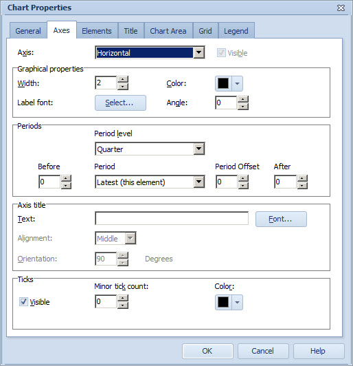
9.To define an initial period, select the period from the Period drop-down menu. You can select from the following options:
•View Default: displays the period selected in the Scorecard or Dashboards view. This option is available only if you have entered the dialog from Symbol Layout window.
•Latest: displays the value for the latest period for which the top element contains a value in the currently selected series. This option is available only if you have entered the dialog from Symbol Layout window.
•Latest For All: displays the value for the latest period containing a value in the currently selected series for each element separately. This option is available only if you have entered the dialog from Symbol Layout window.
•Latest (this element): displays the value of the latest period for the element. This option is available only if you have entered the dialog from Element Properties window.
•Current: displays the current period (i.e. the period that is currently going on).
•Other options depend on the period level selected. For example, if you selected Year as the period level, you can select here the year you want to be the initial period.
10.To select how many periods are displayed before and after the selected initial period, use the arrow buttons in the Before and After fields. You can also type the values in manually.
11.To define the period offset, use the arrow buttons in the Period Offset field. Defining the period offset is useful if you have selected "Current" or "View Default" as the period. The period offset means that the period to be shown is the selected period and the period offset. You can define both positive and negative offsets.
12.To give the axis a title, type a title into the Text box. To change the font, click the Font... button of the Axis title group. The Font Window opens. If title has not been defined, unit of the series defined for the axis is used instead. Note that in the case there are more than one series defined for the same axis, the unit of the first series is shown.
13.To define the alignment of the vertical axis title text, select one of the options from the Alignment drop-down menu.
14.To define the orientation (i.e. the angle) of the vertical axis title text, select or type in the desired degree value between 0 and 90 in the Orientation box.
15.To show the ticks, select the Visible check box in the Ticks group.
16.To define a minor tick count for the vertical axis, use the arrow buttons to select a number. You can also type the value manually.
17.To change the color of the ticks, click the color box labeled as "Color" in the Ticks group and select the color from the drop-down menu.
| Note: The number you select is actually the number of ticks between the numbers of the axis. |
| Note: Only the Period group is applicable to Pie Charts. |
See Also
General Tab of the Chart Properties
General Tab of the Chart Properties (Pie Chart)
General Tab of the Chart Properties (Radar Chart)
General Tab of the Chart Properties (Heat Map Chart)
Elements Tab of the Chart Properties
Title Tab of the Chart Properties
Chart Area Tab of the Chart Properties
Grid Tab of the Chart Properties