 Exercise 134: Create a Chart for Benchmarking Purposes.
 | 1. Open the Benchmarking Exercise model. |
| 2. On the bottom of the Model Navigator frame, click the  to open the Scorecard Navigator. to open the Scorecard Navigator. |
| 3. In the Model Navigator frame, select the Scorecard scorecard. |
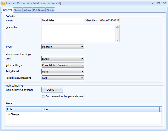
| 4. In the Scorecard Navigator frame, double-click the Total Sales measure to open the Element Properties window. |
| 5. On the General tab, set the Measurement settings like in the picture below: |
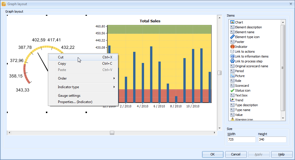
| 6. Switch to the Graph tab and click the Edit Layout button to open the Graph Layout window. |
| 7. Right-click the circular gauge and select Cut from the pop-up menu: |
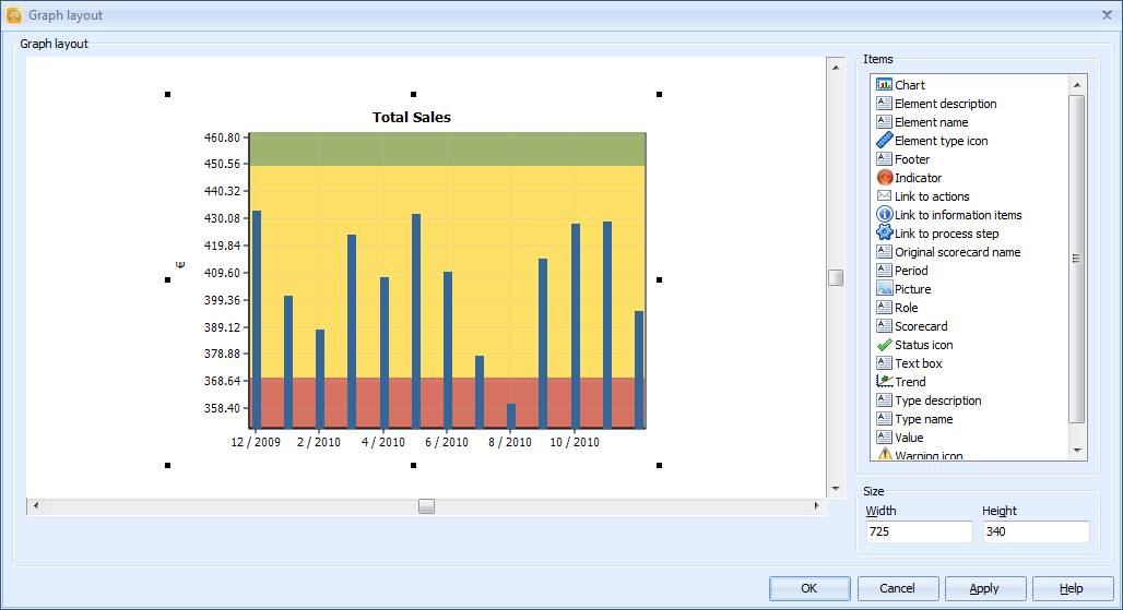
| 8. Drag the chart to the center of the view: |
| 9. Right-click the chart and select Chart settings from the pop-up menu. |
| 10. Remove the selection from the Show ranges with background colors check box. |
| 11. In the Y-Axis group, select the Alarm series and click Settings. |
| 12. In the Series Settings window that opens, select Hide series from the Show series drop-down menu. |
| 13. Similarly, hide also the Target series. |
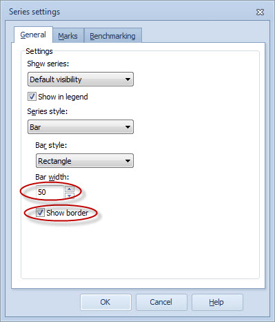
| 14. Select the Actual series and click the Settings button: |
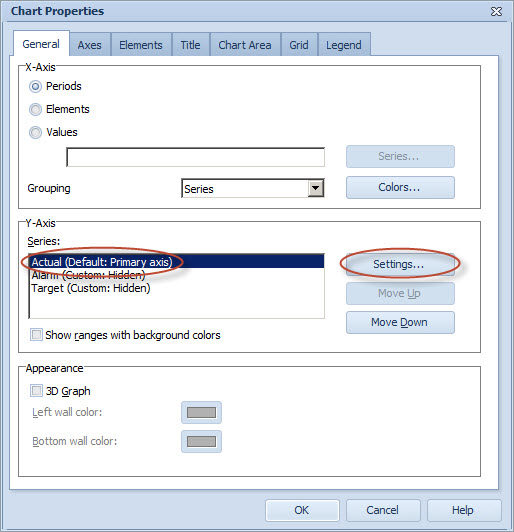
| 15. The Series settings window opens. On the General tab, set the Bar width to 50 and select the Show border check box: |
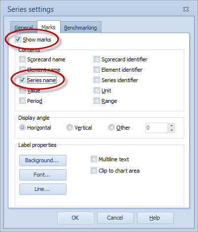
| 16. Switch to the Marks tab and select the Show marks and Series name check boxes: |
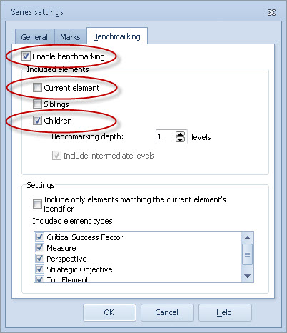
| 17. Switch to the Benchmarking tab and select the Enable benchmarking and Children check boxes. In addition, remove the selection from the Current element check box: |
| 18. Click OK to close the Series settings window. |
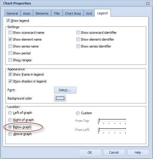
| 19. In the Chart Properties window, switch to the Legend tab. |
| 20. Select the Show legend and Show element name check boxes and remove the selection from the Show ranges and Show series name check boxes: |

| 21. From the Location group, choose Below graph as the location: |
| 22. Click OK to close the Chart Properties window. |
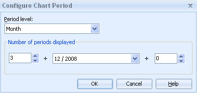
| 23. The chart looks a bit cluttered, so we will define it to show fewer periods. On the Graph tab of the Element Properties window, right-click the chart and select Period from the pop-up menu. |
| 24. The Configure Chart Period window opens. Set the Number of periods displayed to 3 + 12 / 2008 + 0: |
| 25. Click OK. The chart should now look as in the picture below: |

For more information, see the Benchmarking Tab of the Series Window topic in QPR Metrics - User's Guide.