|
|

Connector Graphical Properties Dialog |

|

|

|
||
Connector Graphical Properties Dialog |
|
|
|

|
|
|
Connector Graphical Properties Dialog |
|
|
|
||
Connector Graphical Properties Dialog |
|
|
|
|
|
|
||
This dialog is used to edit the graphical properties of connectors and flows. The dialog can be opened by right-clicking a connector or flow on the diagram and selecting Graphical Properties... from the pop-up menu.
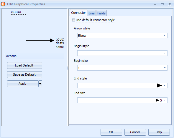
Connector Graphical Properties dialog
Click the Load Default button to apply the default connector graphical properties to the selected connector(s).
Click the Save as Default button to save the current properties as the default graphical properties for the connector.
Click the Apply button to apply the graphical properties. To apply all graphical properties except size to all instances or all connectors of the current type, click the  button and select Apply to All Instances or Apply to All Elements of This Type from the menu.
Model elements for which graphical properties have not been set are shown using the default graphical properties. Setting graphical properties overrides the default properties. View settings, on the other hand, can override graphical properties regarding visible fields.
Connector
To define a custom style for the connector, remove the selection from the Use default connector style and use the drop-down menus to select the desired style:
Select the line style from the Arrow style drop-down box. The options are:
•Elbow: With this option the connector makes 90 degree turns in order to reach its destination.
•Elbow - rounded: This type is very similar to the Elbow type and works in the same way except that the corners (elbows) are rounded with a fixed radius.
•Straight: The connector goes straight from the source element to the destination element.
•Curve: This type resembles the Elbow type, but it makes smooth turns instead of 90 degree turns.
You can choose the style for the starting end of the connector by selecting the desired graphics from the Begin style drop-down box.
You can choose the size for the starting end of the connector by selecting the desired size from the Begin size drop-down box.
You can choose the style for the end of the connector by selecting the desired graphics from the End style drop-down box.
You can choose the size for the end of the connector by selecting the desired size from the End size drop-down box.
Line
The settings on the Line tab define the additional graphical properties for the line used in the connector. To use a custom line, remove the selection from the Use default line style and define the line properties with the following selections:
•The Width of the line in pixels can be defined either by entering a value between 1 and 100 to the value field or by using the arrows on the right side of the field.
•If you want the connector to use a double line, tick the Double line check box. To control the distance between the lines, alter the value in the Distance between lines box. Note that enabling the double line also makes the begin and end symbols larger.
•The Color of the line can be chosen from the drop-down list.
•The Transparency of the line can be defined by using the transparency slider, by entering a value to the field, or by using the arrows next to the field.
•The Dash style of the line can be chosen from the drop-down list. To define a custom dash style, select Custom Line from the drop-down list, and define the pattern in the Custom Dash Pattern field by entering a string that defines the pattern. A valid pattern definition contains an even amount of space-separated values ranging from 0 to 99. The first value in a value pair defines the amount of pixels that are drawn and the second one the amount of pixels that are left empty in the line. So for example a pattern "10 20 15 25" (without the double quotes) draws 10 pixels, leaves a 20-pixel gap, then draws 15 pixels and leaves a 25-pixel gap before starting over from drawing 10 pixels.
Fields
On the Fields tab, you can choose to show or hide the Name, the Source and destination name, and the Description, or any custom attribute types that have been defined for the connector. To use a custom set of fields, remove the selection from the Use default fields check box and use the selection list to define which fields are shown or hidden. New fields can be added by clicking the Add... button. Click Properties... to define the properties for the selected field. Clicking the Delete button deletes the selected field.
Source and Destination Names and Diagrams
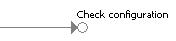
By showing a connector's source and destination names, you can then see from where incoming connectors are coming from and to where outgoing connectors are going. For example, in the following picture, the connector's destination is shown. This allows the model browser to see that the connector leads to the "Check configuration" process step. The source and destination process step name text boxes can be configured similarly as other text boxes related to connectors by clicking the Properties button. This setting works only on connectors that have the circle at the beginning or the end of the connector indicating that they are coming from or going to another diagram.