Feedback on: QPR Knowledge Base 2017.1 - Heat Map ChartsHeat_Map_ChartsMetrics Training Guide > Advanced Graphing > Heat Map Charts /Dear Support Staff,
Heat Map Charts
With heat map charts, companies can position their strategic risks in one graph. The heat map chart provides the user with good understanding of the magnitude and importance of different risks.
Exercise 135: Create a Heat Map Chart.
1. Open the Heat Map Exercise model.
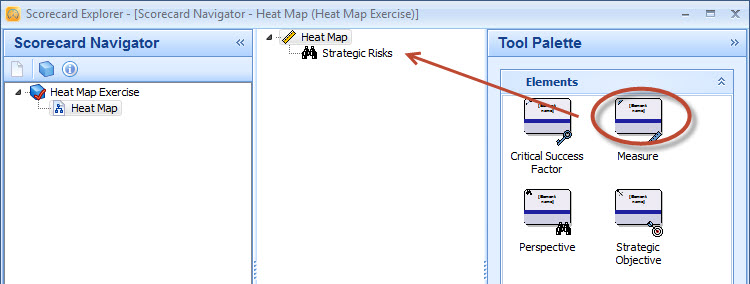
2. On the bottom of the Model Navigator frame, click the to open the Scorecard Navigator.
3. From the Tool Palette, drag four Measure elements under the Strategic Risks perspective:
4. Rename each of the measures by selecting it and pressing the F2 key. Give the measures the names Risk 1, Risk 2, Risk 3 and Risk 4.
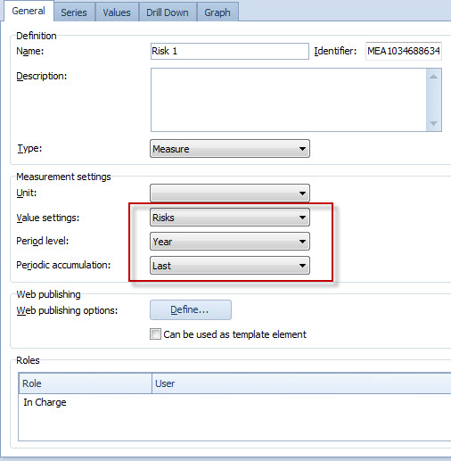
5. Double-click the Risk 1 measure to open the Element Properties window.
6. On the General tab of the Element Properties window, define the measurement settings as in the picture below:
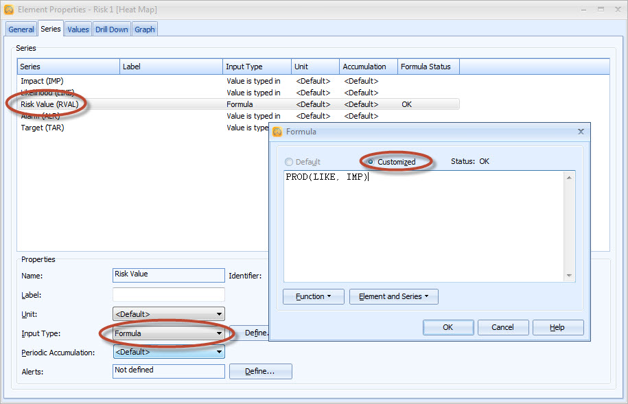
7. Switch to the Series tab.
8. Select the Risk Value series, change the Input Type to Formula and define the formula as PROD(LIKE, IMP):
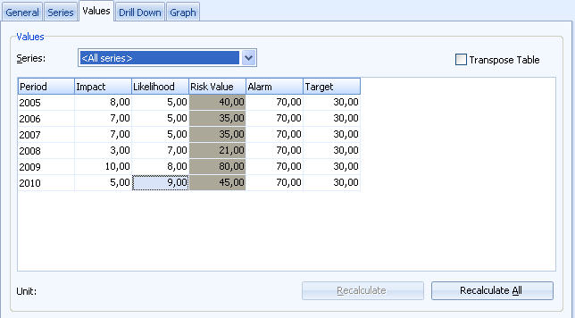
9. Switch to the Values tab.
10. Input values between one and ten to the series. This will make sure that the maximum value of the risk value is 100. For example, the values can be as in the picture below:
11. Close the Element Properties window by clicking the button on the top right corner of the window.
12. Repeat the steps 6-11 for the remaining three risk measures.
13. Next, we'll define the settings for the parent measure. On the Scorecard Navigator, double-click the Strategic Risks perspective.
14. The Element Properties window opens. On the General tab, define the measurement settings as in step 6.
15. Switch to the Graph tab and the Edit Layout button to open the Graph Layout window.
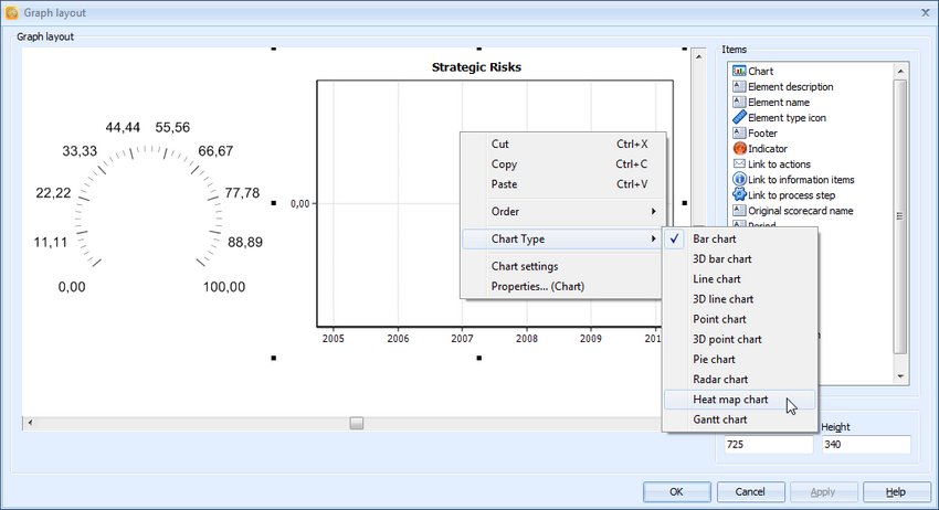
16. Right-click the chart area and select Chart Type > Heat map chart from the pop-up menu:
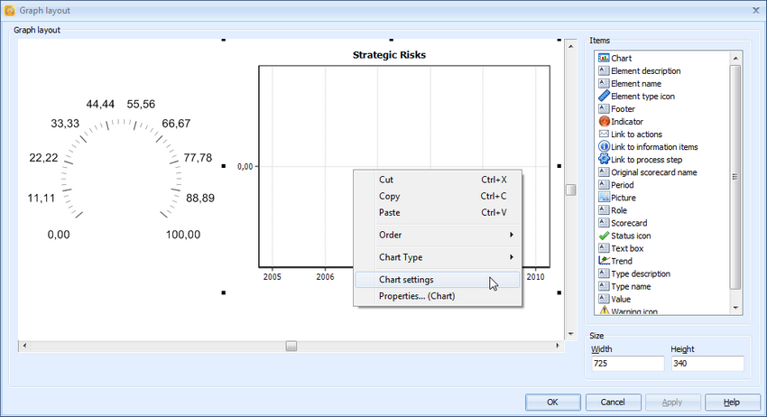
17. Right-click the chart area again and select Chart settings from the pop-up menu:
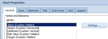
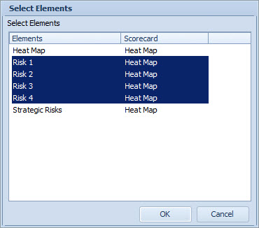
18. The Chart Properties window opens. We'll want to show only the Impact and Likelihood series in the heat map, so for the Alarm, Risk Value and Target,make sure Hide series is selected:
19. Make sure the Impact series is set to Horizontal and the Likelihood is set to Vertical.
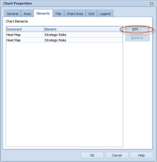
20. Next we'll add the Risk measures to the heat map. Switch to the Elements tab and click the Add... button:
21. The Select Elements window opens. Select the Risk measures we created earlier by clicking the Risk 1 element on the list, holding down the Shift key, clicking the Risk 4 element and clicking OK:
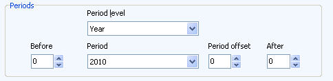
22. Next, we'll define the period for the heat map. In the General tab, define the period as in the picture below:
23. Switch to the Axes tab. From the Axis drop-down menu select Vertical and then Horizontal and make sure that the Visible check box is selected in both selections.
24. Next, we'll select a background for the heat map. Switch to the Chart Area tab. In the Picture group, click the Load button.
25. Select a background image and click Open.
26. Make sure that the Place picture inside the chart check box is selected and click OK to close the Chart Properties window.
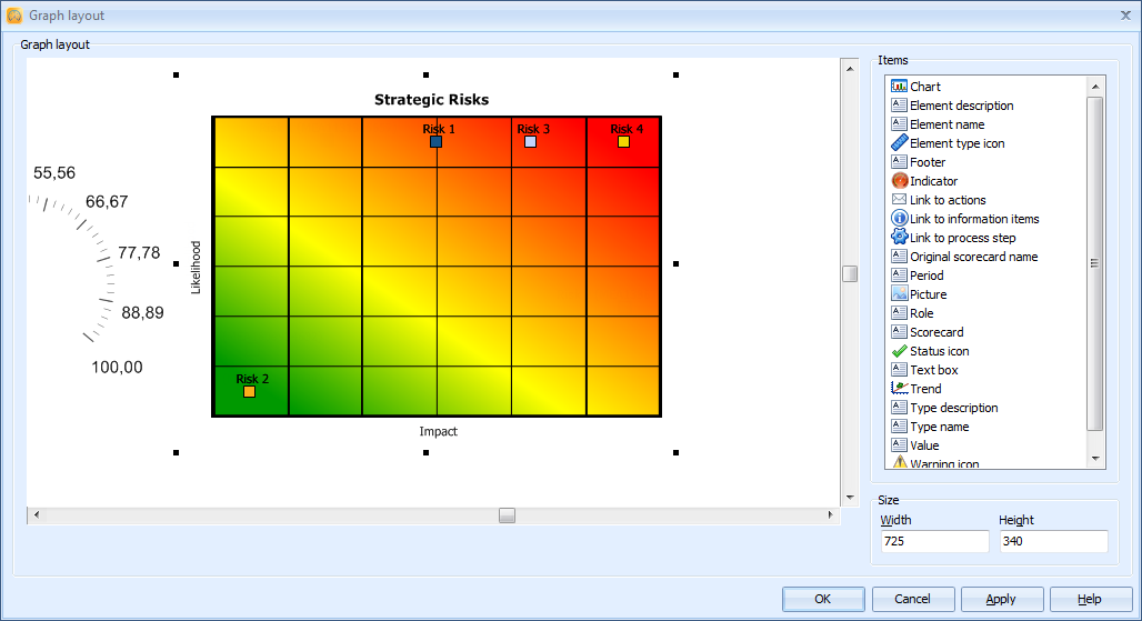
27. The Heat Map chart should now look somewhat as in the picture below:
For more information, see the General Tab of the Chart Properties (Heat Map Chart) topic in QPR Metrics - User's Guide.