|
|

Element Graphical Properties Dialog |

|

|

|
||
Element Graphical Properties Dialog |
|
|
|

|
|
|
Element Graphical Properties Dialog |
|
|
|
||
Element Graphical Properties Dialog |
|
|
|
|
|
|
||
This dialog is used to edit the graphical properties of process steps, custom elements, stores, notes, and groups. The dialog can be opened by right-clicking the model element on the diagram and selecting Graphical Properties... from the pop-up menu.
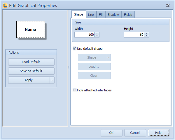
Element Graphical Properties dialog
Click the Load Default button to apply the default graphical properties to the selected element(s).
Click the Save as Default button to save the current properties as the default graphical properties for the element.
Click the Apply button to apply the graphical properties. To apply all graphical properties except size to all instances or all elements of the current type, click the  button and select Apply to All Instances or Apply to All Elements of This Type from the menu.
Model elements for which graphical properties have not been set are shown using the default graphical properties. Setting graphical properties overrides the default properties. View settings, on the other hand, can override graphical properties regarding visible fields.
Shape
The settings on the shape tab define the size and symbol of the model element. To change the size of the element, define the size in the Width and Height fields.
To use a custom shape for the element, remove the selection from the Use default shape check box. The drop-down menu accessible by clicking the Shape button can then be used to change the symbol for the model element. For process step types, the symbol can be loaded also from a graphics file or an xml file using the Load... button. Select an image from the QPR Modeling Client icon library in the C:\ProgramData\QPR Software\QPR 2017\2017.1\Clients\IconLibrary\PGIconLibrary folder, the common icon library in the C:\ProgramData\QPR Software\QPR 2017\2017.1\Clients\IconLibrary\Common folder, or choose from one of your own images to serve as the symbol. Valid file formats are XML files (.xml), Bitmap (.bmp), and Windows Metafile (.wmf). For information about the XML symbol definition, see the 'Customizing Element Symbols in QPR Modeling Client Using XML' topic in QPR - Developer's Guide. To remove the loaded graphics or xml file, click the Clear button.
You can select the symbol shape separately from the image. Thus, if you have chosen a customized image as the symbol, it is drawn as the process step symbol in the diagram. In addition, you can select the symbol shape that is used when connecting connectors to the symbol by using the Shape button. The shape is then shown as a flashing red shape over the image for five seconds.
The selection on Hide attached interfaces check box controls whether Input and Output Interfaces attached to the element are hidden or not.
Line
The settings on the Line tab define the additional graphical properties for the lines used in the element, for example the edges of a process step. To use a custom line, remove the selection from the Use default line style and define the line properties with the following selections:
•The Width of the line in pixels can be defined either by entering a value between 1 and 100 to the value field or by using the arrows on the right side of the field.
•The Color of the line can be chosen from the drop-down list.
•The Transparency of the line can be defined by using the transparency slider, by entering a value to the field, or by using the arrows next to the field.
•The Dash style of the line can be chosen from the drop-down list. To define a custom dash style, select Custom Line from the drop-down list, and define the pattern in the Custom Dash Pattern field by entering a string that defines the pattern. A valid pattern definition contains an even amount of space-separated values ranging from 0 to 99. The first value in a value pair defines the amount of pixels that are drawn and the second one the amount of pixels that are left empty in the line. So for example a pattern "10 20 15 25" (without the double quotes) draws 10 pixels, leaves a 20-pixel gap, then draws 15 pixels and leaves a 25-pixel gap before starting over from drawing 10 pixels.
Fill
The settings on the Fill tab define the additional graphical properties for the background of the element. To use a custom fill style, remove the selection from the Use default fill style check box and define the fill properties with the controls provided:
Style
You can choose the style used in the background of the element from the drop-down list:
•The Solid style fills the background of the element with the chosen color.
•The Transparent style makes the element transparent, so that other elements that are behind it on the diagram can be seen through it.
•The Gradient style colors the background with a gradual blend of the primary color and the secondary color. From the Gradient Type drop-down list, you can select whether to use a rectangle or a linear gradient type. The settings of the rectangle gradient type are fixed. For the linear gradient type, you can select the direction of the gradient from the Gradient Mode drop-down list.
•The Texture style uses an image as the background of the element. You can select the image by clicking the Browse button. In addition, you can select how the texture is used on the element from the Wrap Mode drop-down menu.
•The Hatch style applies a hatch pattern to the background of the element using the primary and secondary colors. You can select the pattern from the Hatch Style drop-down list.
Colors
You can define the colors used in the chosen style from the Primary Color and Secondary Color drop-down lists. The levels of transparency for both colors can be defined by using the Transparency sliders, by entering a value to the fields next to the sliders, or by using the arrows next to the fields. Adding transparency will make the other elements behind the selected element visible through the selected element.
Shadow
The settings on the Shadow tab define the shadow of the element. To use a custom shadow, remove the selection from the Use default shadow style check box and define the shadow properties with the controls provided:
•Select the Draw shadow check box to enable the shadow.
•Use the Color drop-down menu to select the color of the shadow.
•Use the sliders, enter a value to the field, or use the arrows next to the field to define the rest of the shadow settings.
Fields
On the Fields tab, you can choose to show or hide the Name, Description, Owner, Icon container, Subprocess contents, Instance icon, Number of instances, Interface source and destination, or any custom attribute types that have been defined for the element. To use a custom set of fields, remove the selection from the Use default fields check box and use the selection list to define which fields are shown or hidden. New fields can be added by clicking the Add... button. Click Properties... to define the properties for the selected field. Clicking the Delete button deletes the selected field.
Interface Source and Destination
The 'Interface source and destination' field is usable in Input and Output Interface elements. The field will show the name of the element to which any incoming or outgoing connectors are connected, accompanied by the name of the diagram containing the connected element. If the connected element is also an interface element, the name shown is the element to which the interface element is connected. The field can display multiple values. In QPR Portal, it is possible to open the corresponding diagram by clicking a name shown on the field.