The diagram visualizes the flow of the process. It shows process steps, stores and flows between them. Notes and Information items connected to process steps are shown as icons inside them. The transfer type of a flow is shown as icon. Organization Items can be shown as rows or columns on the chart, depending on the modeling direction. Process steps can be grouped by a Group symbol indicating the start and end process step. Notes can be shown as posters on the chart. The diagram of the selected diagram level is shown. The diagram contents can also be shown which enables editing several diagrams at the same time.
A new diagram window can be opened by:
 in the View tab of the ribbon, select Diagram View > New Diagram View
The new diagram will use the modeling direction that has been set as default in the Modeling Options dialog.
From the View tab of the ribbon you can access View Settings options to control what is shown on the diagram.
The diagram includes three panels for navigating, browsing and drawing purposes: Diagram Explorer, Preview, and Tool Palette. The Diagram Explorer and the Preview are located on the left side of the window and the Tool Palette on the right side of the window.
The Diagram Explorer is used for navigating the diagram. The Back  and Forward
  buttons, located at the top of the Diagram Hierarchy panel, offer a handy, web browser-like way to move between different states in the diagram. Use these buttons to return to a previous diagram, to use a previous zoom factor or to return to an original place after a peek at an earlier location.
Using the drawing tools in the Tool Palette you can create model elements or add drawing elements in the diagram. You can also drag and drop elements from the Diagram Explorer to the diagram to instantiate them.
The Preview allows you to select the portion of the diagram to view easily.
You can also scroll and zoom the diagram drawing area.
 The diagram contents can also be displayed in multiple languages. See Multilingual Modeling section for more information.
An active diagram window can be closed by:
•clicking the X button on the top right corner of the diagram window
•pressing Ctrl + W
Selecting Elements on the Diagram
By default, the Select tool  located on the Home tab of the ribbon is in use for selecting the model elements in the diagram. Clicking an element on the diagram will select it. Holding down the Alt key and clicking an element will select all elements that are of the same element type as the element that was clicked.
Holding down either the Shift or Ctrl key and clicking on an element will add the element to the current selection.
Holding down the Shift and Alt keys or Shift and Ctrl keys and clicking an unselected element on the diagram will add all elements of that type to the current selection. Conversely, holding down the Shift and Alt keys or Shift and Ctrl keys and clicking a selected element on the diagram will remove all elements of that type from the current selection.
Using Pop-up Menus
Pop-up menus are an essential part of the diagram. They contain the most often needed commands that can be executed on the selected elements. Some important commands are available only in the pop-up menus. You can access the pop-up menus by clicking the right mouse button on the diagram drawing area.
The commands available on the pop-up menu depend on the type and number of the selected model elements. A pop-up menu usually includes the following commands:
•editing commands, e.g. Cut, Copy, Paste and Paste Special
•access to graphical properties, e.g. Graphical properties or Change name font
•changing the modeling direction
•alignment of model elements
•alignment of model element texts
•depth order of model elements
•showing and hiding model elements
•access to model element properties, e.g. Process step properties
•access to page setup settings
•access to the print preview dialog
•changing the values of custom attributes (if enumerated custom attributes have been defined for the element)
•access to the Metrics link properties (if the Metrics link is enabled)
•execute a procedure (if the element has a procedure custom attribute defined)
Part of the diagram can be replaced by a child diagram to simplify the representation. This is done by first selecting the part of the diagram, e.g. by area selection, and then selecting Create Child Diagram from the pop-up menu. A new diagram is created under the current one and all the selected elements are moved down onto that diagram. This is very useful if modeling of the process is done in a from-bottom-to-top way.
It is possible to align the existing model elements on the diagram. Only flows and organization items cannot be aligned. Alignment is done by first selecting two or more elements from the diagram and then selecting the alignment edge from the pop-up menu. The elements can be aligned by their top, bottom, left or right edges. The alignment is done with respect to the first selected element. Notice that it is very easy to place elements onto each other by accident. If this happens, the situation is easily corrected with Undo button.
Hiding Elements on Diagram
There is a pop-up menu for Flow, Process step, Element, Store, Group and Note type of elements (both for a single element and for multiple elements), "Hide <typename>(s)". Selecting this menu item hides the selected element(s) from the diagram view. If multiple elements of different types are selected, the menu item is named "Hide Element(s)". This menu item is shown only if all selected elements can be hidden.
Hidden elements can be made visible again with "Show Hidden" popup menu shown when the right mouse is clicked on an empty diagram space. The sub-menu of "Show Hidden" has the following items.
•"All Connectors" (shown only if there are hidden connectors on the diagram).
•<connector name> for each hidden connector.
•In a similar way, "All Process Steps", "All Elements", "All Stores", "All Groups", "All Notes" (shown only if there are hidden elements of that particular type).
•<model object name> for each hidden element, under its type.
Notes about modeling while there are hidden elements on the diagram:
•If there are connectors connected to hidden elements, the connectors are automatically disconnected from the element if the end of the connector is moved.
•Connectors cannot be connected to hidden elements on the diagram.
•It there are elements inside hidden groups, the elements are automatically moved away from the group when the elements are moved.
•If there are hidden elements inside a group, they are moved with the group.
•If there are hidden elements inside a group, and the group is resized, the elements are removed from the group if the group is resized so that the element is left outside the group. There will be no visual indication of this.
•Hidden elements will never be added to a group when a group is moved or resized.
•If attached elements are hidden, they are moved with the parent element when that element is moved and they remain attached.
•If the parent element of an attached element is hidden, moving the attached element will remove the attachment relation.
Using Editing Commands
Regular editing commands, such as Cut, Copy and Paste, can be accessed from the pop-up menu and used in the diagram. In addition, Paste Special contains a subcommand Paste as Instance. By selecting the Paste as Instance command, if there is an instantiable element (a process step, store or organization item) on the clipboard, a new instance of the element is created instead of creating a new element.
Modifying and Deleting Model Elements
The properties for the selected model element can be changed by accessing the model element properties dialog from the pop-up menu or by double clicking the model element.
Graphical options for the selected elements can be changed by using the graphical properties dialogs. These dialogs can be accessed by selecting Graphical properties from the pop-up menu.
In the diagram view the user can add linefeeds (blank lines) and tab characters to the names of the objects in the view. Linefeeds can be added by pressing Ctrl+Enter, tabs by pressing the Tab key. Editing is finished with the Enter key as usual.
The Custom Views dialog is used to create and modify view settings as well as set the default view settings used for the model.
The selected model elements can be deleted from the model.
Switching Between Diagram
If the model has several diagrams, you can move between the diagrams in the following ways:
•using the Diagram Explorer on the left frame of the view
•using the pop-up menu to move up or down a level
•using Back and Forward buttons to move between previously visited diagrams.
If you have selected a diagram you can drill down to it by selecting Down to Child Diagram from the pop-up menu (click right mouse button). The diagram is changed to the selected diagram and its contents are shown. If there is a parent diagram for the current one, you can select Up to Parent Diagram from the pop-up menu to show the higher level diagram. E.g. if you use Down to Child Diagram you can get back to the level you started on by selecting Up to Parent Diagram.
In the case of a diagram element, you can also select Show Diagram Content from the pop-up menu. Then you can view and modify the child diagram contents in the same view in the parent diagram inside the child diagram content element if you have rights to that diagram. To hide the contents, select Hide Diagram Content from the pop-up menu. For these options to be visible, the element needs to have the "Diagram contents" option selected in the Graphical Properties Dialog and also the "Can be collapsed" option selected in the Text Box Properties for Model Elements Dialog. You can also use the [+] and [-] symbol shown inside the diagram content element to show or hide diagram contents.
If you have selected a connector (e.g. a flow), you can move between the source diagram and the destination diagram of the connector by selecting Show Diagram and then either Source Diagram or Destination Diagram from the pop-up menu.
Type Groups with Diagram Views
Latest modeling templates like ArchiMate 3,X heavily utilize type groups for setting proper tool palette stencils and view settings for diagram views. Previous template implementations required creating separate view elements in order to separate possibly tens of different view types. With 2023.1 release a diagram specific type group setting was introduced, that can be set also by User. Typically a template can be created so that there are several Tool palette stencils for View types each having a definition for View's type group. When the user creates a new view from Tool palette, the view's type group is set automatically to Diagram element, and then whenever the view is opened from Diagram explorer or by following the Diagram link, the type group is set effective. The effective type group determines which stencils the Tool palette shows and what is the View setting used.
Effective type group and related view setting is determined by the following rules. When Diagram view is opened:
•If the diagram element has a type group set, use that.
•If the diagram's element type has a type group set, use that.
•If the tool palette type group is set to "All" by the user, then change the effective view setting to Default view setting.
•When changing the diagram, if the element and type do not have a type group set, change the effective view setting to Default view setting.
Linking Diagrams with Custom Attributes
Typically diagrams in a model form a diagram hierarchy that can be navigated through with Diagram Explorer. Diagrams can also be linked with one another using custom relation attributes of type "Diagrams" (see Creating and Modifying Custom Attribute Types). Diagram relation links can be followed (Drill down) using Linked Diagrams functionality. To create and activate Linked Diagrams functionality use the following steps:Create custom attribute type relation to Diagrams. (Optionally add an image to the relation type.)Assign custom attribute type to some element type. Note that cardinality can be also N.Edit element type's graphical properties and add the custom attribute to Fields so that Value format is "Show value as image"Create an element on a diagram and use the Element Properties dialog to add some relations to other diagrams to the custom attributeAfter that, when right-clicking the image on the diagram, a pop-up menu listing all the links for the custom attribute is displayed. Also element's context pop-up menu shows a menu item "Linked Diagrams" that has a sub-menu listing all the links. Selecting a link from the list will change the active diagram according to the link target and also update the Diagram Explorer accordingly.
For published models Linked Diagrams in Portal can be activated by editing Web Style:Select Modeling options and from Model elements list select the element type wanted.Click the "Web Styles..." button to edit Element type's web style properties.Change "Link destination", "Link to" value to "Diagram"Save the modelClicking on QPR Portal the element on Diagram view causes active Diagram to change according to the link target. If the attribute's cardinality is N then a list of linked diagrams is shown first.
Changing the Visualization Mode of Custom Attribute Types
If you have created custom attribute types (such as relation attributes) with many values in QPR 7.5, you may notice that they are displayed differently in newer versions due to visualization mode changes. While it is highly recommended for you to adapt the layout for the new visualization mode, you can also toggle between the new and the old visualization mode by pressing the F7 key in the diagram view. You can also make the old visualization mode the default choice in your QPR Modeling Client by changing the value of the HorizontalAttributeList key to 1 in the QPR_Clients.ini file (For further information, refer to QPR - Administrator's Guide). Note, however, that Portal users might see the layout differently depending on whether the HorizontalAttributeList is set to 0 (new visualization style) or 1 (old visualization style) in the QPR_Servers.ini controlling the QPR Portal. By default, both the QPR Modeling Client and QPR Portal use the new vertical visualization mode for custom attribute values.
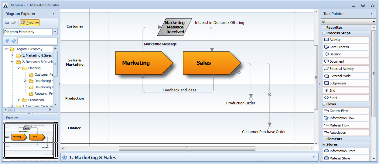
Diagram View