|
|

Web Style Dialog for Elements |

|

|

|
||
Web Style Dialog for Elements |
|
|
|

|
|
|
Web Style Dialog for Elements |
|
|
|
||
Web Style Dialog for Elements |
|
|
|
|
|
|
||
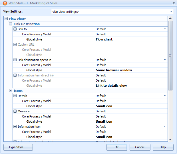
This Web Style dialog is used to define and view web publishing settings of an element or an element type. The link destination, icon settings and Metrics link settings for the selected element or element type are shown and can be defined. The hierarchy shows the effective value in bold letters and also where that value is coming from, for example from a Global style or from an element type's style.
Web Style Dialog for an Element
View Settings
Depending on the element, the View Settings drop-down menu is enabled or disabled. When the menu is enabled, select the View Settings to which the Web Style is linked.
Link Destination
Model element information is opened in Details View by default, or in the case of diagrams, clicking the element opens the child diagram. If you want some other view to be opened when the element is clicked, select the desired option from the Link to drop-down list. The options are:
•Customized URL Clicking the element in QPR Portal opens a page defined in the Custom URL field below
•Details View Clicking the element in QPR Portal opens the details view.
•Diagram Clicking the element in QPR Portal opens the diagram containing the element. This option is available only for diagrams.
•Information Item Clicking the element in QPR Portal opens an information item (if any) connected to the element. In the case there are multiple information items connected to the element, the information item set as default will be opened.
•No link Nothing happens if the element is clicked in QPR Portal.
•Metrics measure view If Metrics link is used and the element is clicked in QPR Portal, the Element View of the linked Metrics element is opened.
•External model If the element has an external model type custom attribute, the model defined as the value of the custom attribute is opened. In case the element has multiple external model custom attributes or a single cardinality N custom attribute with multiple values, a selection list for choosing which external model to open is shown. If the external model custom attribute has an URL as its value, the URL is opened.
Link Destination Opens In
Pages linked to the selected model element can be opened either in the current or new window. When "Default" is selected, the setting defined for the element type is used. Note that this setting has no effect if the link's destination is Details View, Metrics Measure View, or External Model.
Icons
Icon settings can be applied to element type views that support icons on diagrams. If there are links available, they are listed and settings can be applied to each type of icon. If there are no links available, all of the "Icons" options are disabled.
Use the drop-down menus to select the settings for the icons. When "Default" is selected, the default settings are applied. You can select whether the icon is hidden, a small icon, or a large icon. With information items there is also the "Direct link to location" option, which makes the information item's icon a direct link to the information location, so the information item will be opened directly instead of the details view.
Link Placement
With Link Placement options, the link placement settings of connectors can be modified. As these options concern only connectors, they are visible only when this dialog is opened for for connectors.
Use the Link placement drop-down menu to define link placement. Select either "Default", "Transfer type", or "Name" option. To define links for empty connectors, select either "Default", "No link for empty", or "Link visible" from the Link for empty type drop-down menu.
Metrics Link
Click Edit to open the Metrics Link dialog, in which the Metrics Link settings can be defined:
Select the Default check box to make the element use default Metrics Link properties.
Metrics measure indicator: This setting defines how the Metrics measure indicators are shown on the diagram. The options are:
Hide indicator |
The indicator is not shown at all. |
Show measure icon |
The indicator is shown as an icon in the element image. |
Show indicator |
The indicator is shown below the element. |
If you wish to have the Metrics measure's indicator color as the background for the element symbol, check the Use measure color as background color option. You can make the measure value and period visible on the diagram in QPR Portal by enabling the Show Metrics measure value and period option. This setting is independent of the indicator setting, so if this setting is enabled but the indicator is hidden, then only the measure value and the period are shown below the process step. Select the Show Metrics measure name option to show the linked Metrics measure's name under the element. If this option is not enabled, you can still see the measure name in the hint text that you can display by hovering the mouse over the measure icon (if displayed) at the lower right corner of a process step in QPR Portal. However, if the indicator is hidden and the measure value and period are not chosen to be shown, then the name is not displayed even though the Show Metrics measure name option is enabled.
Details View
With Details View options, it is possible to customize the list of properties and custom attributes that are shown in the Details View and in the 'All Properties' and 'Quick Properties' tabs in the Details Pane of QPR Portal. Click Edit to open the Web Style Dialog for defining the customized list. This section is available only for Global and Element Type web styles. Note that these settings override corresponding settings made in the web templates. If the element type, base model, and global settings all use default settings, then the settings configured in the web templates are used.
If this dialog was opened for an element, the Type Style... button is available. Clicking it will open the Web Style dialog for the element type in question.