|
|

Symbol Layout Window |

|

|

|
||
Symbol Layout Window |
|
|
|

|
|
|
Symbol Layout Window |
|
|
|
||
Symbol Layout Window |
|
|
|
|
|
|
||
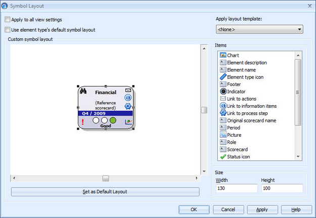
The Symbol Layout window for individual elements
In many views, such as the Hierarchy Views and the Dashboards, elements are represented by a graphical Element Symbol. The graphical properties of an element or shape symbol can be modified by right-clicking the symbol and selecting the Symbol Layout option from the pop-up menu. This will open the Symbol Layout window. Also free shapes have a customizable layout, and the Symbol Layout window is used for the shapes as well with the distinction that there are fewer items available for free shapes. Shapes are also specific to views, i.e. in the case you change to another view, shapes defined for the previous view are not available.
The following items are available for symbol layouts for elements:
•Chart
•Element description
•Element name
•Element type icon
•Footer
•Indicator. There are four types of indicators available: Range icon, Traffic lights, Linear gauge, and Circular gauge.
•Link to actions. Provides a link to actions connected to the element. Note that the link is visible only in QPR Portal.
•Link to information items. Provides a link to information items connected to the element. Note that the link is visible only in QPR Portal.
•Link to process step. Provides a link to a connected QPR Modeling Client process step. Note that the link is visible only in QPR Portal.
•Original scorecard name. Displays the name of the original scorecard in the case of reference elements
•Period. Displays the name of the shown period
•Role. The text in this item depends on the role that is defined in the Role tag on the Text Tab of the Layout Item Properties window and the corresponding user defined for that role in the Element Properties window.
•Picture
•Scorecard. Displays the name of the scorecard the element belongs to in parentheses.
•Status icon. Displays the status icon of the shown period and series if the series uses status options and a status is set for the shown period and series.
•Text box
•Trend
•Type description
•Type name
•Value
•Warning icon
The following items are available for symbol layouts for free shapes:
•Footer
•Picture
•Text box
•Type description
•Type name
On the left side of the window there is a sample view in which you can preview the appearance of the symbol before applying it.
Modifying Element or Shape Symbols
To change properties of one or many Element or Shape Symbols:
| 1. | Select the symbol(s) to be modified in the Hierarchy Views or the Dashboards. Multiple elements or shapes can be selected by holding the Ctrl key down. |
| 2. | Right-click on the selected symbol (or on any of the selected symbols) and select Symbol Layout from the pop-up menu. |
| 3. | Make the desired changes. Alternatively you can select to use the element/shape type's default symbol layout by checking the "Use element/shape type's default symbol layout" checkbox. See the Customizing Symbol's Layout section below for more information about modifying the layout. |
| 4. | Click Apply button to apply the changes to the symbol(s). |
| Click the OK button to save the current symbol settings and exit the Symbol Layout window. |
Modifying Texts in Element Symbols and Shapes
To modify the texts (element name, element description and text box contents) in Element or Shape symbols:
| 1. | In the Hierarchy View or the Dashboards view, select the desired element or shape and press the F2 key. The text that is changed to editing mode is determined in the following priority: Name - Description - Text box, i.e. in the case the Name item is not included in the symbol, Description is activated and so forth. In the case there are multiple instances of the same item included in the symbol, the topmost item is opened into the editing mode. |
| 2. | Alternatively, right-click on the element symbol on the Hierarchy View or the Dashboards view and select either Rename, Edit Description, or Edit Text option from the pop-up menu. The visibility of the options depends on the elements included in the symbol. Note that to access text box items, the mouse cursor must be over the desired text box when opening the pop-up menu. |
| 3. | Type in the modified text and press Enter to confirm the changes. To cancel all changes and close the editing mode, press Esc. |
Customizing Symbol's Layout
To customize the element or shape symbol's layout:
| 1. | In the case the "Use element/shape type's default symbol layout" option is checked, uncheck it to allow changes to the layout. The default layout is defined in the Modeling Options dialog as explained below in the "Defining Default Symbol Layout for Element Types" section. |
| 2. | You can also choose to apply a layout template to the element symbol by selecting the desired template from the Apply layout template drop-down menu. Note that this operation is purely one-way, i.e. the current layout of the template is applied to the element and any possible future updates done to the template are not applied to the symbol layout. Similarly modifications made here are not applied to the layout template. |
| 3. | Define the width and height of the symbol by modifying the values in the Width and Height fields at the lower right corner of the window. |
| 4. | Select a symbol item from the Items list on the right side of the window. Alternatively, you can copy items already included in the layout by selecting the desired item(s) and pressing Ctrl+C or by right-clicking on the item and selecting Copy from the pop-up menu. You can also copy several elements at the same time by selecting the desired elements with the Ctrl key pressed down and right-clicking on some of the selected elements to bring up the pop-up menu. The copied selection can be pasted by pressing Ctrl+V or right-clicking on the preview area and selecting Paste from the pop-up menu. |
| 5. | Drag the item to the desired location in the symbol preview on the left side of the window. |
6. With overlapping items, define the depth order of the items by right-clicking on an item and selecting Order > Send to Back / Bring to Front / Send Backward / Bring Forward from the pop-up menu. Note that the background shape will always remain under the other layout items.
| 7. | In the case of a resizable item, you can resize the item by dragging on some on the eight resize handles. Element type icons, links to actions, links to information items, links to process steps, trend, and warning icon are not resizable elements. |
| 8. | To define settings for the item, right click on the item and select Properties... (<name of the item>) from the pop-up menu. This will open the properties window for the selected item. For charts, you can also change the settings by selecting Chart settings from the pop-up menu. This will open the Chart Properties Window. |
| 9. | After making your changes, click the OK button to close the properties window. |
| 10. | To apply the change to the selected element/shape type in all views, check the "Apply to all views" checkbox. This option is available only for element types, since shapes are view specific. When this option is checked, the changes are applied to the element in all views the element appears in. In addition, if the element has been set to use the element type's default layout in some other view and you select this option in a view where the default settings aren't in use, the "Use element type's default symbol layout" checkbox is cleared from the element also in other views (or vice versa). |
| 11. | If you want to make the new layout the default layout for the selected element/shape type, click the "Set as Default Layout" button. This affects all elements and shapes of the given type if those shapes or elements have the "Use element/shape type's default symbol layout" option checked. |
Changing the Indicator Type
To change the indicator type (indicator is available only for elements):
1.Right-click on the indicator to open a pop-up menu.
2.Select the desired indicator type from the Indicator type submenu.
3.In the case the indicator type is linear gauge or traffic lights, there's also an Indicator orientation submenu where you can select the orientation of the indicator. Furthermore, if the indicator type is linear gauge, there's also an Inverted needle option in the menu where you can select the orientation of the needle inside the gauge. In the case the indicator type is circular gauge, the Gauge settings is available in the pop-up menu. Selecting Gauge settings will open the Indicator Configuration Window where you can configure the tick marks, among other things.
Adding Pictures to Symbols
One of the items available for the element or shape symbol is Picture. To add a picture, simply select the Picture item from the list and drag it to the location where you want to add the picture. A file selection dialog will open and you can select the desired image file. The Picture layout item has a few extra characteristics compared to other layout items:
•Supported image formats are BMP, PNG, JPG, and GIF
•The picture will be placed to the position where you drag the Picture item and the image will be in its full size. You can resize the image by dragging on the resize handles around the picture or by right-clicking on the image and selecting the Properties... (Picture) option from the pop-up menu. This opens the Layout Item Properties window
•The pop-up menu contains also a Select Picture... option, which allows you to select another picture to replace the existing one
•In the case you resize a PNG image using Alpha channel transparency, its transparency will be lost. In the case the background color of a PNG image is the transparent color, resize does not affect the transparency.
•For transparent images you need to use either PNG or GIF. In addition, BMP images with the size of 16x16 pixels or smaller use the color in the bottom left corner of the image as the transparent color. In the QPR Metrics client the transparent color is displayed as transparent, but in QPR Portal it is displayed as white.
Removing Items from an Element Symbol
To remove an item, right-click on the item and select Cut from the pop-up menu. You can also remove several elements at the same time by selecting the desired elements with the Ctrl key pressed down and right-clicking on some of the selected elements to bring up the pop-up menu. The item is now removed from the element and moved to the clipboard. Alternatively select the element and press the Delete key. In the case of removing an element with the Delete key, the element is removed without placing it into the clipboard.
Click the Apply button to take your changes into use without closing the window. Clicking the OK button applies your changes and closes the window. The Cancel button closes the window without committing any changes and the Help button displays this topic.
Defining Default Symbol Layout for Element Types
The default layout for element or shape types can be defined using the Modeling Options dialog.
The window for setting the default symbol layout works otherwise similarly as the functionality described above, but there are no "Apply to all views" and "Use element/shape type's default symbol layout" check boxes nor the Set as Default Layout button and the Apply layout template drop-down menu. In addition, there is a Force to Elements/Shapes button, which takes any changes you apply to the default layout into use in all the elements of that type in the current model or in all shapes of that type in the current view.
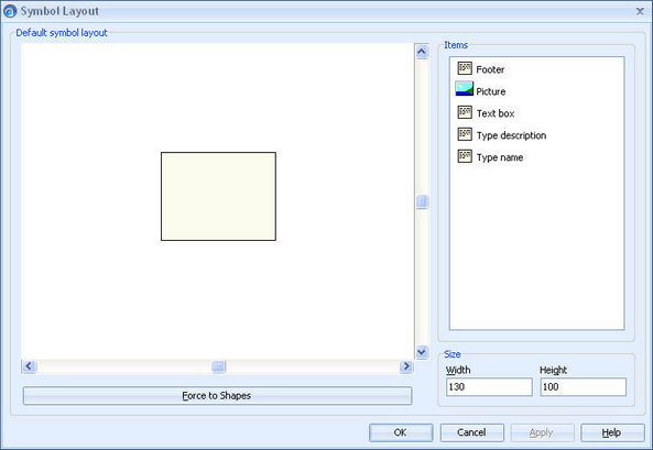
The Symbol Layout window for shape types