|
|

Analysis |

|

|

|
||
Analysis |
|
|
|

|
|
|
Analysis |
|
|
|
||
Analysis |
|
|
|
|
|
|
||
The analysis window is used to input, modify and analyze measure values. A new analysis window can be opened by selecting New analysis under the ![]() Analysis View button on the View tab of the ribbon. Note that you need at least rights to measures to access the Analysis view.
Analysis View button on the View tab of the ribbon. Note that you need at least rights to measures to access the Analysis view.
The analysis window contains the Analysis tab, measures, values, and unit settings, and the area for the spreadsheet or graphs. The Current analysis settings can be saved for future usage. Saving and opening can be performed from the Analysis tab buttons.
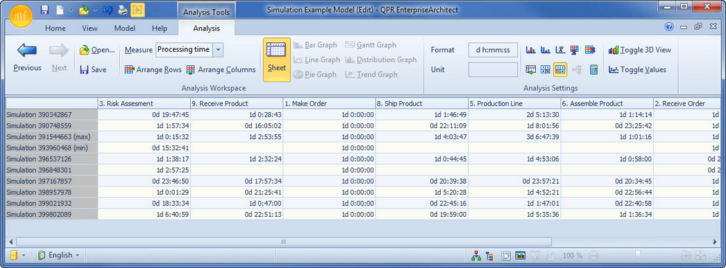
Spreadsheet
The spreadsheet shows the measure values for the selected measure in numerical format. The selected cases are shown as rows of the sheet and can be selected from the Select rows for analysis sheet rows dialog. The columns are analyzed process steps, connectors and groups. The columns can be selected from the Select columns for analysis sheet dialog.
The measure values can be inputted and modified in the spreadsheet by typing, or from other applications by copy-paste.
Graphs
The selected rows or columns in the spreadsheet can be shown as graphs by clicking the appropriate button in the Analysis tab of the ribbon for the desired graph. You can select the desired rows by clicking the leftmost column in the sheet that shows the case name. You can select multiple rows by pressing down the left mouse button at the starting row and dragging the mouse to the end row and releasing the mouse button. To select multiple areas, hold down the Ctrl key while selecting the rows. The columns can be selected by clicking the header of the column. Multiple columns can be selected the same way as rows are selected.
![]() Bar graph: The bar graph shows measure values for rows as bars. Multiple rows can be shown simultaneously in these graphs.
Bar graph: The bar graph shows measure values for rows as bars. Multiple rows can be shown simultaneously in these graphs.
![]() Line graph: The line graph shows measure values for rows as continuous lines. Multiple rows can be shown simultaneously in these graphs.
Line graph: The line graph shows measure values for rows as continuous lines. Multiple rows can be shown simultaneously in these graphs.
![]() Pie graph: The pie chart shows the relative shares for measure values in the selected row. Only one row can be shown at a time.
Pie graph: The pie chart shows the relative shares for measure values in the selected row. Only one row can be shown at a time.
![]() Gantt graph: The Gantt graph is available only for measures with start and end values. Usually it is used to show lead-time. Only one row can be shown at a time.
Gantt graph: The Gantt graph is available only for measures with start and end values. Usually it is used to show lead-time. Only one row can be shown at a time.
![]() Distribution graph: The distribution graph shows the distribution of measure values for selected columns as bar graphs. The distribution graph can be used to analyze how much variation there is between different cases. For a distribution graph a dialog for setting the options for the distribution is shown. The range for the values to be included in the graph as well as the number of subranges into which the selected range will be divided can be defined. The default range is from the lowest selected value to the highest selected value. Multiple columns can be shown simultaneously in these graphs.
Distribution graph: The distribution graph shows the distribution of measure values for selected columns as bar graphs. The distribution graph can be used to analyze how much variation there is between different cases. For a distribution graph a dialog for setting the options for the distribution is shown. The range for the values to be included in the graph as well as the number of subranges into which the selected range will be divided can be defined. The default range is from the lowest selected value to the highest selected value. Multiple columns can be shown simultaneously in these graphs.
![]() Trend graph: The trend graph shows measure values for the selected columns. It can be used to analyze the trend of the cases. Multiple columns can be shown simultaneously in these graphs.
Trend graph: The trend graph shows measure values for the selected columns. It can be used to analyze the trend of the cases. Multiple columns can be shown simultaneously in these graphs.
For graphs you can select whether you want to view then in 2D or 3D using the 2D/3D button ![]() . The Gantt graph can be viewed only in 2D. You can also select whether you want to show the value labels in the graph or not by clicking the Show values button
. The Gantt graph can be viewed only in 2D. You can also select whether you want to show the value labels in the graph or not by clicking the Show values button ![]() .
.
Calculations
The measure values can be shown normally or cumulatively by pressing down the Cumulative button in the Analysis tab of the ribbon. The cumulative state sums the measure values from left to right so that the rightmost column shows the total sum for the case. The cumulative calculation is available only for single value measures.
The ![]() Ignore Zero Values button and the
Ignore Zero Values button and the ![]() Ignore Missing Values button are enabled when a measure is selected. When either button is selected (i.e. pressed down), then the measure value is automatically recalculated with the selected setting (i.e. ignore zero values/missing values). These settings can also be defined for a certain Measure in the Measure Properties dialog.
Ignore Missing Values button are enabled when a measure is selected. When either button is selected (i.e. pressed down), then the measure value is automatically recalculated with the selected setting (i.e. ignore zero values/missing values). These settings can also be defined for a certain Measure in the Measure Properties dialog.
Also the smallest and greatest total values can be calculated and the average and sum for the cases in the spreadsheet. These values are shown as rows below the other cases. The following buttons can be used for the calculations:
![]() Smallest total
Smallest total
![]() Greatest total
Greatest total
![]() Average
Average
![]() Sum of rows
Sum of rows
![]() Sum of columns
Sum of columns
QPR Modeling Client can calculate the Critical path for the selected measure and case. The critical path is the path with the greatest total of measure values summed along the path. The process steps and flows in the path are selected as columns for the spreadsheet. If a process step or flow does not have measure values input for the selected case and measure, it is ignored in the calculations, and is not selected as a column, even if it was otherwise in the path.
The critical path cannot be calculated if no measure values have been input, or the process does not have a starting point for a path, that is a process step with no incoming flows or a connector that starts from scratch. The critical path can be calculated for single value measures only.