|
|

General Tab of the Chart Properties (Heat Map Chart) |

|

|

|
||
General Tab of the Chart Properties (Heat Map Chart) |
|
|
|

|
|
|
General Tab of the Chart Properties (Heat Map Chart) |
|
|
|
||
General Tab of the Chart Properties (Heat Map Chart) |
|
|
|
|
|
|
||
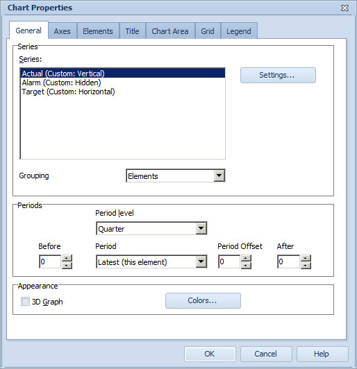
Series Group
To configure the chart series for the Heat Map Chart:
1.Select the Series from the list.
2.To define the settings for the series, select Settings... The Series Settings Window opens.
3.To define the axis on which the series are attached to on the chart, right-click a series on the list and select Horizontal or Vertical. You can toggle the visibility of the series on the heat map chart by right-clicking the desired series and selecting or unselecting Hide Series from the pop-up menu. Note that the Heat Map Chart must always contain one series for both the horizontal and the vertical axes, otherwise the chart will not be shown.
To define the grouping for the Heat Map Chart, use the Grouping drop-down list:
•Elements: The points of each element belong to the same group and are colored similarly.
•Scorecards: The elements of different scorecards have different colors. This is useful in scorecard comparisons.
•Periods: The points of each period belong to the same group and are colored similarly.
The colors used are those defined in the Appearance Group.
Periods Group
To select the periods that are shown, select the period level from the Period level drop-down menu and the period from the Period drop-down menu. You can select from the following options:
•Latest (this element): displays the element's latest period that has a value.
•Latest (each element): displays the latest period of each heat map element separately, instead of using the latest period of the current element. This means that, for heat maps, both benchmark elements and manually selected elements are taken into account, and that the current element uses the latest period of the element.
•Current: displays the current period (i.e. the period that is currently going on).
•Other options depend on the period level selected. For example, if you selected Year as the period level, you can select here the year you want to be the initial period.
To select how many periods are displayed before and after the selected initial period, use the arrow buttons in the Before and After fields. You can also type the values in manually. To define the period offset, use the arrow buttons in the Period Offset field. Defining the period offset is useful if you have selected "Current" as the period. The period offset means that the period to be shown is the selected period and the period offset. You can define both positive and negative offsets. When several periods are selected, a point for each period will be drawn on the Heat Map Chart.
Appearance Group
Select the 3D Graph check box to display the depth dimension in the chart.
To define the colors used for the selection in the Grouping drop down list, click the Colors... button. This will open the Color Scheme window.
See Also
General Tab of the Chart Properties Window
General Tab of the Chart Properties (Pie Chart)
General Tab of the Chart Properties (Radar Chart)
General Tab of the Chart Properties (Gantt Chart)
Axes Tab of the Chart Properties
Elements Tab of the Chart Properties
Title Tab of the Chart Properties
Chart Area Tab of the Chart Properties
Grid Tab of the Chart Properties