|
|

General Tab of the Chart Properties |

|

|

|
||
General Tab of the Chart Properties |
|
|
|

|
|
|
General Tab of the Chart Properties |
|
|
|
||
General Tab of the Chart Properties |
|
|
|
|
|
|
||
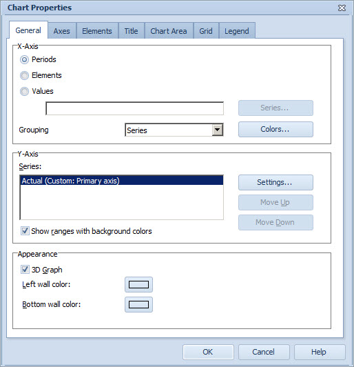
X-Axis Group
You can set the X-axis (i.e. the horizontal axis) of the graph to show either time, elements or series. To set the horizontal axis to show time, select the Periods radio button in the X-Axis group. To define the shown periods, see Axes Tab of the Chart Properties. If you have enabled benchmarking for the series, you can include the same series from other elements (siblings and/or immediate children) as well to be shown in the graph for comparison.
If you select the Elements radio button, elements are shown on the horizontal axis. The current element is shown by default. The benchmarking settings can be combined to the Elements option as well to enable comparison of different elements.
If you select the Values radio button, series are shown on the horizontal axis. You can select the element series also from a different element to be shown on the graph. To define the series, you can either type in the name of the series directly to the field below, or select it by clicking Series... and selecting the series from the list in the Select Series Window. If you type in only the series identifier to the field, then the current element is used. Similarly, if you type in only the element identifier and series identifier, the scorecard to be used is the current one.
In the case that Values has been selected, the lowest and highest value of the element series selected for the horizontal axis will be the limits of the horizontal axis. The values are shown as points which represent the value the element series has in each period. The graph is always a 2D point graph when Values has been selected.
The benchmarking settings can be combined to the Values option as well to enable comparison of different elements.
The selection in the Grouping drop-down menu depends on the type you have selected from the X-axis. The option defines in which order the bars are drawn in the group. For example, if you selected Periods to be shown on the X-axis and you select Series in the Grouping drop-down menu, groups consisting of values for the same period are shown on the X-axis. The values within the group are then arranged primarily according to the series.
If you have selected Values for the X-axis, the Grouping setting is not valid.
You can define the colors to be shown on the X-axis in the Color Scheme Window accessible by clicking the Colors button.
Y-Axis Group
To configure chart series for the Y-axis (i.e. the vertical axis):
1.Select the Series from the list.
2.To define the settings for the series, select Settings... The Series Settings Window opens. Alternatively, you can right-click on the series to use a pop-up menu for the following quick options: Hide Series, Primary Axis, Secondary Axis, and Default visibility. (For explanations on these options, see General Tab of the Series Settings Window).
3.To sort the order of the series drawn in the chart, you can use the Move up and Move down buttons. To change the order, select the series and click either Move up or Move down. The first series in the list will be drawn first in the chart, and so on.
4.Select the "Show ranges with background colors" option to have the ranges displayed with background colors. This option is only valid when periods are shown on the horizontal axis. In the case this option is unchecked, you can e.g. configure range limit series to be displayed as lines or for instance hide the range limits. Also, the order set for series shown in the graph applies to range limits when this option is unchecked.
Appearance Group
Select the 3D Graph check box to display the depth dimension in a chart.
Your chart, when being viewed with the depth dimension (three dimensional charts), has walls along its left and bottom sides. To specify the properties of these chart walls, do the following:
| 1. | To define the color of the Left wall, click the color box labeled as "Left wall color". Or to define the color of the Bottom wall, click the color box labeled as "Bottom wall color". |
| 2. | The Color Editor window, in which you can select a color for the wall, opens. |
| 3. | Once you have selected a color, the selected color is shown next to the button Left wall or Bottom wall. |
| 4. | Click OK to apply the selected wall colors to the Chart's walls. |
Note: The walls are visible only with the 3D Line Chart, 3D Bar Chart, and 3D Point Chart.
See Also
General Tab of the Chart Properties (Pie Chart)
General Tab of the Chart Properties (Radar Chart)
General Tab of the Chart Properties (Heat Map Chart)
General Tab of the Chart Properties (Gantt Chart)
Axes Tab of the Chart Properties
Elements Tab of the Chart Properties
Title Tab of the Chart Properties
Chart Area Tab of the Chart Properties
Grid Tab of the Chart Properties