|
|

Navigator View Settings |

|

|

|
||
Navigator View Settings |
|
|
|

|
|
|
Navigator View Settings |
|
|
|
||
Navigator View Settings |
|
|
|
|
|
|
||
The view settings for a Navigator View can be modified in the View Settings dialog accessible by clicking the  button when the Navigator View is open.
General
The General tab shows the name and description of the View Settings.
The check boxes in the Used in group define whether the view settings are used in the Navigator view and/or Diagram Explorer (hierarchy).
Select the Publish in Portal check box to have the view settings (hierarchy) selectable in the Navigator view of QPR Portal. This option is not applicable to SharePoint hierarchies, Element types hierarchies, Custom attribute types hierarchies or Type groups hierarchies. If the view setting is inside a folder that isn't published in QPR Portal, the view setting isn't published in QPR Portal regardless of its "Publish in Portal" setting.
To link the Navigator view settings to QPR Portal view settings, type in the QPR Portal view settings name in the Linked Portal View Settings field. The linked Portal view settings are then used by default when the published Navigator view is selected in QPR Portal. If the linked Portal view settings are not defined or a Portal view with the given name is not found, the default Portal view settings are used.
Elements
The Elements tab shows which elements are shown in the navigator views list.
The Hierarchy group is used to select the shown hierarchy:
•Elements as list: selecting this will make the view show the element types selected in the Additional Elements group as a simple list, i.e. no hierarchy at all.
• Element types: selecting this will make the view show the element types selected in the Additional Elements group. This hierarchy type is available only if the Metamodel Browsing feature is enabled by your license.
•Custom attribute types: selecting this will make the view show the custom attribute types selected in the Additional Elements group. This hierarchy type is available only if the Metamodel Browsing feature is enabled by your license.
•Type groups: selecting this will make the view show the type groups. This hierarchy type is available only if the Metamodel Browsing feature is enabled by your license.
•Duplicate Element Management: selecting this will make the view show duplicate elements in the model.
•Custom Relation Hierarchy: selecting this will make the view show the element types and relation attributes (i.e. connectors and relation type custom attributes) selected in the Additional Elements group.
• ECM Hierarchy: selecting this will make the view show the folder hierarchy and the documents in the Enterprise Content Management site defined in the ECM Server settings group. Note that this will only show the hierarchy, documents are not created as information items until they are dragged and dropped to an element or the diagram.
•SharePoint hierarchy: selecting this will make the view show the folder hierarchy and the documents in the SharePoint document site defined in the SharePoint settings group. Note that this will only show the hierarchy, documents are not created as information items until they are dragged and dropped to an element or the diagram.
•System hierarchies: selecting one of these hierarchies will make the view show the elements of the corresponding fixed element types. See the topics Diagram Hierarchy, Organization Hierarchy, Notes Hierarchy, Resource Groups, Resource Pools and Information Hierarchy for more information.
•Custom hierarchies: selecting one of these hierarchies will make the view show the elements in the user defined element hierarchy.
The Additional Elements group is used to select additional leaf nodes for the hierarchy. The contents of the Additional Elements group depend on the hierarchy selected in the Hierarchy group:
•Elements as list: all element types available in the model.
•Element types: process step types, element types, connector types and system types can be selected. See the topic Element Types for more information. This hierarchy type is available only if the Metamodel Browsing feature is enabled by your license.
•Custom attribute types: basic attribute type, link attribute types and enumerated values can be selected. See the topic Custom Attribute Types for more information. This hierarchy type is available only if the Metamodel Browsing feature is enabled by your license.
•Type groups: no additional options can be selected. See the topic Type Groups for more information. This hierarchy type is available only if the Metamodel Browsing feature is enabled by your license.
•Relation hierarchy: all element types and relation attributes can be selected. There are three selection types. If the check box has a check mark, the item can be at root level in the hierarchy. If the check box is filled, the item can appear only as a child node in the hierarchy. If the check box is unchecked, the item is not shown on the hierarchy.
To select attribute(s) for multiple element types at once:
1.On the Additional Elements group, select the element types for which you want to select attribute(s) either by clicking a generic type node (such as "Process step types") or by holding down either the Shift or Control key and clicking on the element types.
2.Select the attributes from the Relations group, which shows all the supported relation attributes from all of the selected element types.
•If all the selected element types have the relation attribute(s), the attribute(s) are shown in the default color.
•If the relation attribute(s) shown exist only in a subset of the selected element types, the attributes are shown in grey.
3.Click OK. The relations will then be set for each element type that have the selected relation attributes.
•Diagram hierarchy: any non-diagram process step type, connector type, element type, store type and group instances are shown as leaf nodes for the diagrams they exist in. Resources (allocated to), note (connected to) and organization item (belongs to) are shown as leaf nodes for the previously mentioned leaf nodes and child diagram nodes.
•Organization hierarchy: process step types and resources that belong to an organization item are shown as leaf nodes of the organization item.
•Information hierarchy: process step types, connector types and element types are shown as leaf nodes if an information item is connected to the element.
•Notes hierarchy: none
•Resource Group hierarchy: process step types, connector types and element types are shown as leaf nodes if the resource is used in the element.
•Resource Pool hierarchy: process step types, connector types and element types are shown as leaf nodes if the resource is used in the element.
•Custom hierarchies: connector types (incoming and outgoing flows), resources (allocated to), notes (connected to), information items (connected to).
The SharePoint Settings group is used to define the SharePoint site address and the way information items are created:
•SharePoint site's address: enter the URL of the SharePoint site to this field.
•Information item creation mode: this setting defines how information items are created when documents are dragged from the hierarchy to the elements on the diagram. If the target element supports information items, the dragged items will be instantiated as information items under that element. Otherwise, they are created as information items that are not associated to any diagram element. The creation mode of folders will always be 'Linked'.
The ECM Settings group is used to define the ECM site address and the way information items are created:
•ECM site's address: enter the URL of the ECM site to this field. The address must point to a valid Content Management Interoperability Services (CMIS) entry point of an ECM system that supports the CMIS 1.0 API.
•Information item creation mode: this setting defines how information items are created when documents are dragged from the hierarchy to the elements on the diagram. If the target element supports information items, the dragged items will be instantiated as information items under that element. Otherwise, they are created as information items that are not associated to any diagram element. The creation mode of folders will always be 'Linked'.
The Base Model Settings group is used to define settings for seeing base model element usage in child models:
•Show child model instances: when this is selected and a base model element has been instantiated in child models, the child model instances are shown as sub-nodes of the element.
•Show child usage: when this option is selected and a base model element has been used in child models, the child models are shown as sub-nodes of the element. Here, the term "used" means that the child model element has a relation to the base model element, for example via a custom relation attribute or by using a base model information item in a child model activity.
For the child sub-nodes, the pop-up menu available via right-clicking an element has the Open selection available. Selecting it will open the child model in question in a new client, and if the child sub-node is a child model instance, the diagram view will be opened with the instance selected.
The Base Model Settings selections are not used in QPR Portal or in Model Comparison.
The Hierarchy Options group is used to define additional settings for navigator views that show hierarchies:
•Hide duplicate relations: when selected, the navigator view will not show duplicate relations, created for example by having two or more instances of an element with a relation to some other element.
•Default view filter: the View Filter that is applied automatically when the navigator view in question is opened. When a default view filter is selected, the filter is applied also in QPR Portal.
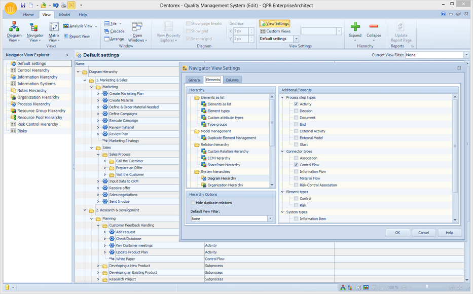
The Elements Tab of the Navigator View Settings Dialog and Additional Elements Shown as Leaf Nodes in the Default Settings View
Columns
The Columns tab lists the columns that are shown in the Navigator view. To add a column, click the Add button, type a name for the column in the Label field and select the attribute to be shown from the drop-down menu. To remove a column, select the column to be removed and click the Remove button. Note that the last column cannot be removed. To change the order of the columns, select a column and click the Up or Down buttons.
The columns you can add are listed in the following table:
Column Name |
Column Description |
|---|---|
Name |
Displays the name of the element. |
Type |
Displays the type of the element. |
Description |
Displays the description of the element. |
Owner |
Displays the owner of the element. |
Transfer Type |
Displays the transfer type (valid only for connectors). |
Uses version information |
Displays whether the diagram element uses version information. |
Version |
Displays the version of the model or a child diagram. |
Status |
Displays the status of a child diagram or the model. |
Author |
Displays the author of a child diagram or the model. |
Comment |
Displays comment connected to a child diagram or to the model. |
Version information last changed |
Displays the date and time when the element's version information was last changed (this might not be the last actual modification). |
Organization unit type |
Displays the type of an organization item. |
Store type |
Displays whether a store is a material store or an information store. |
Resource type |
Displays the type of a resource. |
Information item type |
Displays the type of information items. |
Information location |
Displays the location of information items. |
Symbol |
Displays the symbol of the element. |
Base model element |
Displays whether elements come from the base model in the child model. |
Validation warning icon |
Displays the validation warning icon (visible only in the Modeling Client, not in QPR Portal). |
Validation warning message |
Displays the validation warning message (visible only in the Modeling Client, not in QPR Portal). |
Model name |
Displays the name of the model. |
Model path |
Displays the path of the model. |
Number of instances |
Displays the total number of instances the element has in the model. |
Information Item Usage |
For information items, displays the list of elements where the information item is used. |
Parent diagram |
For all elements that can be drawn on a diagram, this column displays the parent diagram name of the current instance (if the view shows instances as separate nodes) or the list of parent diagram names of all instances sorted by name (if the view shows one node for all instances). |
External model |
For external model elements, this column displays the information location of the external model referenced by the element. |
External Model URL |
For external model elements, this column displays the custom URL. This column is editable and the changed value is saved to the external model element. |
From |
For connectors, this column displays the element names where the connector is coming from. |
To |
For connectors, this column displays the element names where the connector is going to. |
Outgoing connectors |
For all connectable elements, this column displays the lists of the outgoing connector names for the current instance. |
Incoming connectors |
For all connectable elements, this column displays the lists of the incoming connector names for the current instance. |
Attached |
For all elements that allow attached elements, this column displays the lists of the attached element names for the current instance. |
Attached to |
For all elements that allow attaching to elements, this column displays the element names where this element is attached to for the current instance. |
Information Items |
Displays the list of information item names used in this element. |
Notes |
Displays the list of note names used in this element |
Parent Organization |
Displays the upper level organization item of the organization item. |
Child Organizations |
Displays the immediate child organization items of the organization item. |
Resources |
For organization items, displays the Person type resources used. |
Process Steps |
For organization items, displays the process steps in the organization item. |
Parent Note |
Displays the upper level note of the note. |
Child Notes |
Displays the immediate child notes of the note. |
Child Information Items |
Displays the immediate child information items of the information item. |
Parent Information Items |
Displays the upper level information item of the information item. |
Data Type |
For information items, displays whether the information item is embedded or linked. |
Organization Item |
For Person type resources, displays the list of organization items where the resource is used. |
Resource Usage |
For resources, displays the list of elements where the resource is used. |
Custom attribute types |
Displays the custom attribute types of the element type or type group. |
Behavior |
Displays the enabled behaviors of the element type. |
Default type group |
Displays the type group that has been selected as the default for the element type. |
Start relations |
Displays the start relations of the element type. |
End relations |
Displays the end relations of the element type. |
Group relations |
Displays relations to child elements of the element type. |
Input relations |
Displays the input interface relations of the element type. |
Output relations |
Displays the output interface relations of the element type. |
Type groups |
Displays the type groups of the element type. |
Relation target type |
For custom attribute types, displays the target type of the relation. |
Two-way link |
For custom attribute types, displays the two-way link to another relation. |
Sub-attributes |
For custom attribute types, displays the sub-attributes of the attribute set. |
Enumerated values |
For custom attribute types, displays the enumerated values. |
Default procedure |
Displays the default procedure of the custom attribute type. |
Used in |
Displays in which element types and attribute types the custom attribute type is used. |
Used in element types |
Displays in which element types the custom attribute type is used. |
Used in attribute types |
Displays in which attribute types the custom attribute type is used. |
Linked attribute |
For custom attribute types, displays the linked attribute. |
Element types |
Displays the element types of type groups. |
Stencils |
Displays the stencils of type groups. |
View settings |
Displays the view settings of type groups. |
Mapped source interface |
For connectors, shows the interface elements where the connector start is connected to. |
Mapped destination interface |
For connectors, shows the interface elements where the connector end is connected to. |
If the Fit columns to view check box is selected, all columns will be scaled down so that they fit into the view. When unselected, the Width of the columns can be defined separately.
Columns in QPR Portal
The columns defined on the Columns tab are by default used in the corresponding Navigator Views in QPR Portal.
The columns that are shown in QPR Portal Navigator Views are determined in the following order:
1. If a View Setting for the Processes > Navigator View has been set in QPR Portal for the currently shown hierarchy, then the columns specified there are used.
2. If Default View Settings for the Processes > Navigator View have been defined or "Navigator" has been defined as the default page for Processes tab in QPR Portal, then the columns specified there are used.
•Note that only the settings defined for one hierarchy are stored at once. Thus, e.g. when you first customize one hierarchy and another hierarchy after that, only the last customizations are stored. In addition, these customizations are usable only within the hierarchy for which they were defined. This also means that when you customize web client view settings for one hierarchy and select another hierarchy, that other hierarchy is shown using the columns defined in its default view settings.
•Copying customized QPR Portal View Settings from a hierarchy to another can be done by first saving the View Settings in QPR Portal (by using the Save button in the View Designer) and then by selecting those saved View Settings when the desired hierarchy is selected (by using the Views button in the toolbar).
3. If "Linked Portal View Settings" have been defined for the view, then the columns specified there are used.
4. Columns configured into the View Settings in the Modeling Client are used.
The column headers of custom attributes show the name of the custom attribute in QPR Portal. The custom attribute fields in the Navigator View in QPR Portal are shown using the default templates for the custom attributes. Therefore, for example relation type custom attributes contain a link to the related element.
Note that the "Validation warning icon and "Validation warning message" columns are not supported in QPR Portal Navigator views.
See the Custom Views Dialog topic for instructions on how to delete or copy a navigator view or how to create a new navigator view. The Custom Views dialog is also used to create View Filters.